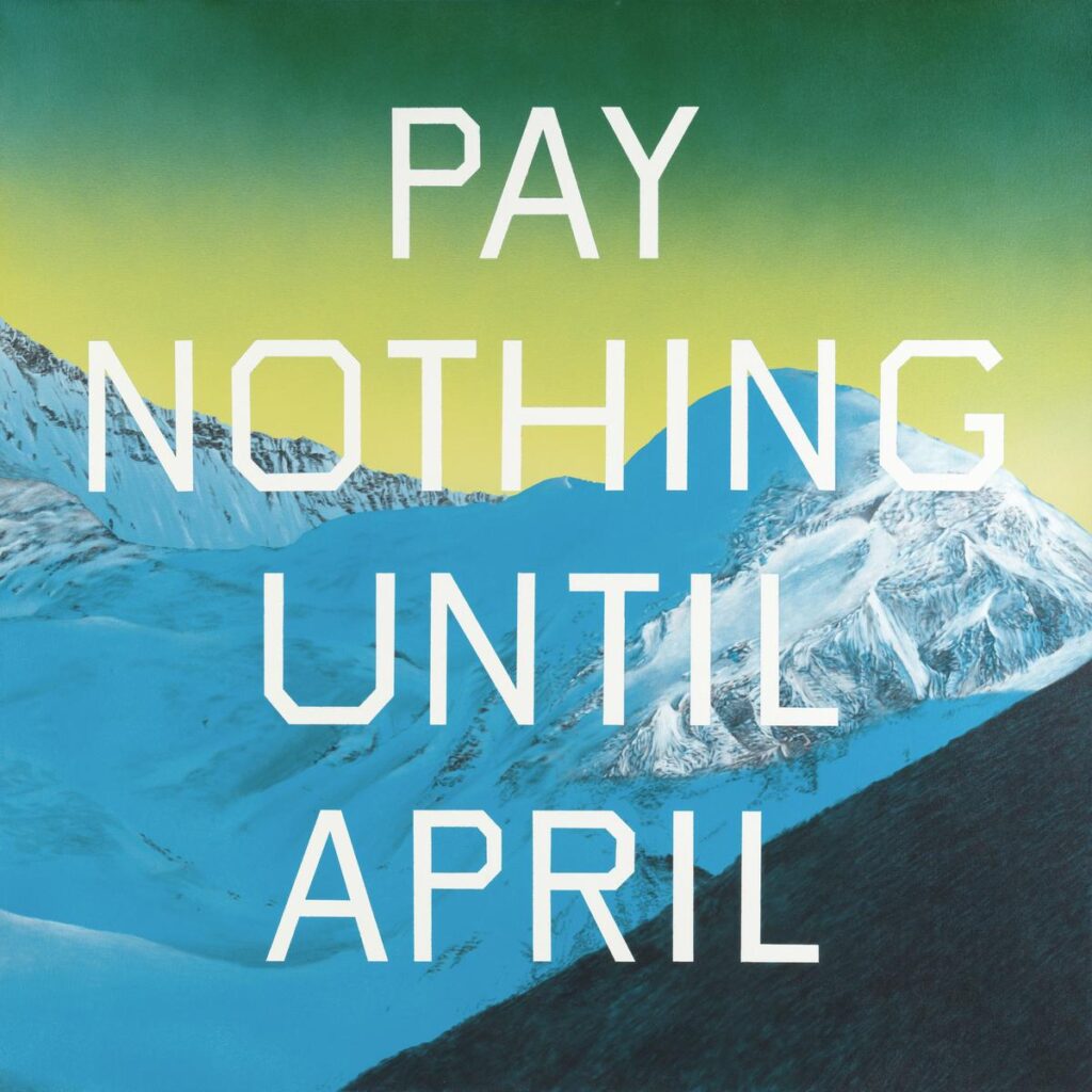
Edward Ruscha is an American fine artist with something significant to say about pop culture and advertising. His work, which sometimes looks like an ad, also has something to teach the makers of pop culture and advertising.
According to The Tate:
Words and phrases are at the centre of Ed Ruscha’s work and first appear in his paintings as early as 1959. The use of words and text in twentieth century art can first be traced back to cubist painters such as Georges Braque and Pablo Picasso who added letters and words, painted and collaged, into still lifes. Playing with language was also central to dada artists who left an important legacy with their radical, often humorous use of words.
Words integrated into works of art are something we have seen before, but what does it mean when Ruscha places “banal, consumerist text” on top of awe-inspiring natural imagery (as he does in the painting above)? Maybe he simply enjoys playful juxtapositions. Maybe it means commercial language and sparkling peaks are all competing for mindshare in a culture awash in both garbage and stunning beauty.
Let’s hear it from Ruscha directly.
Ruscha, who is currently featured in a retrospective at MOMA, says: “I like the tension of having a combination of words, or a word in front of something that is also lively in itself like a mountaintop. And a lot of these mountaintops, they suggest glory or beauty., things like that. They almost have their own orchestration. You know you can almost hear trumpets playing and I like that reference.”
The artist thinks deeply about how best to place text on a background. In commercial art or art direction, we also want to think deeply about the use of text in our layouts, but we need to act fast and deliver work that meets a strategic objective set forth by the client. Ruscha’s objective is to make art that pleases him and that’s a freedom all artists seek.
Despite the restraints placed on commercial artists, I think we can apply some of Ruscha’s ideas and methods. We can care about how text, especially the headline, looks on the page. It has to belong there, naturally, just like “the mountain” belongs.
For artists to flourish, they first must find and then develop their voice. In Ruscha’s case, his voice (and the work that resulted) was in direct response to what was current and critically admired at the time.
In this video interview for the Louisiana Museum of Modern Art (located in Denmark), he said, “I think a lot of artists felt like Abstract Expressionism and minimalism and that sort of thing was maybe exhausted or had been so well stated that it would be difficult to state anything more. So, it was a natural evolution for people to begin moving in different directions, and I’m one of those artists who just saw that common objects had more appeal to me than throwing paint at a canvas.”
Discover more from Adpulp
Subscribe to get the latest posts sent to your email.


